Welcome to the

In partnership with media partner

In partnership with media partner
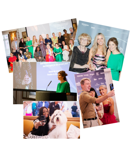
uFurnish.com, the UK’s #1 search and discovery website for home furniture and furnishings, is thrilled to be running the 2026 uFurnish.com Home Awards alongside our media partner Metro. These Awards recognise all the amazing people who create and share their beautiful interiors and designs of their own home, including content creators, influencers, home innovators and bloggers. The third year of our annual Awards promises to build upon the excitement of the past two years with a panel of expert judges and a broad range of exciting categories to enter all culminating in a glitzy ceremony in October 2026. The winners will receive an Award trophy, features on uFurnish.com's website and social media channels and media partner Metro's website and social media channels.
As the founder of uFurnish.com I am extremely passionate about our homes. That’s why I created uFurnish.com, so people across the UK have a platform that empowers them to create their dream home with confidence. This year is our third year of the uFurnish.com Home Awards and I continue to be blown away by the incredible response, talent and community within the home interiors space. One of my favourite days of the year is the magnificent awards ceremony where I am lucky enough to meet so many creative and inspiring people. These Awards are about recognising those people who are inspiring others to turn their home visions into reality and I cannot wait to see what 2026 brings!